Completed in the 7th and 8th semesters of Visual Design in 2022.
With Ana Luísa Escorcio Antiorio, Luisa Gomes Rodrigues, and Nicole Abe Mizutani. Supervised by Prof. Me. Claudia Weber.
Knowledge and flavors of the cachaça from Paraty. This was my graduation project, aiming to propose a new visual identity for the Pedra Branca distillery, capable of promoting its differentiation in the market and celebrating the history and culture of the city of Paraty. The project was presented through a thesis, consisting of a theoretical research part to understand the segment and opportunities within the theme, and another part with a new design proposal for the distillery.
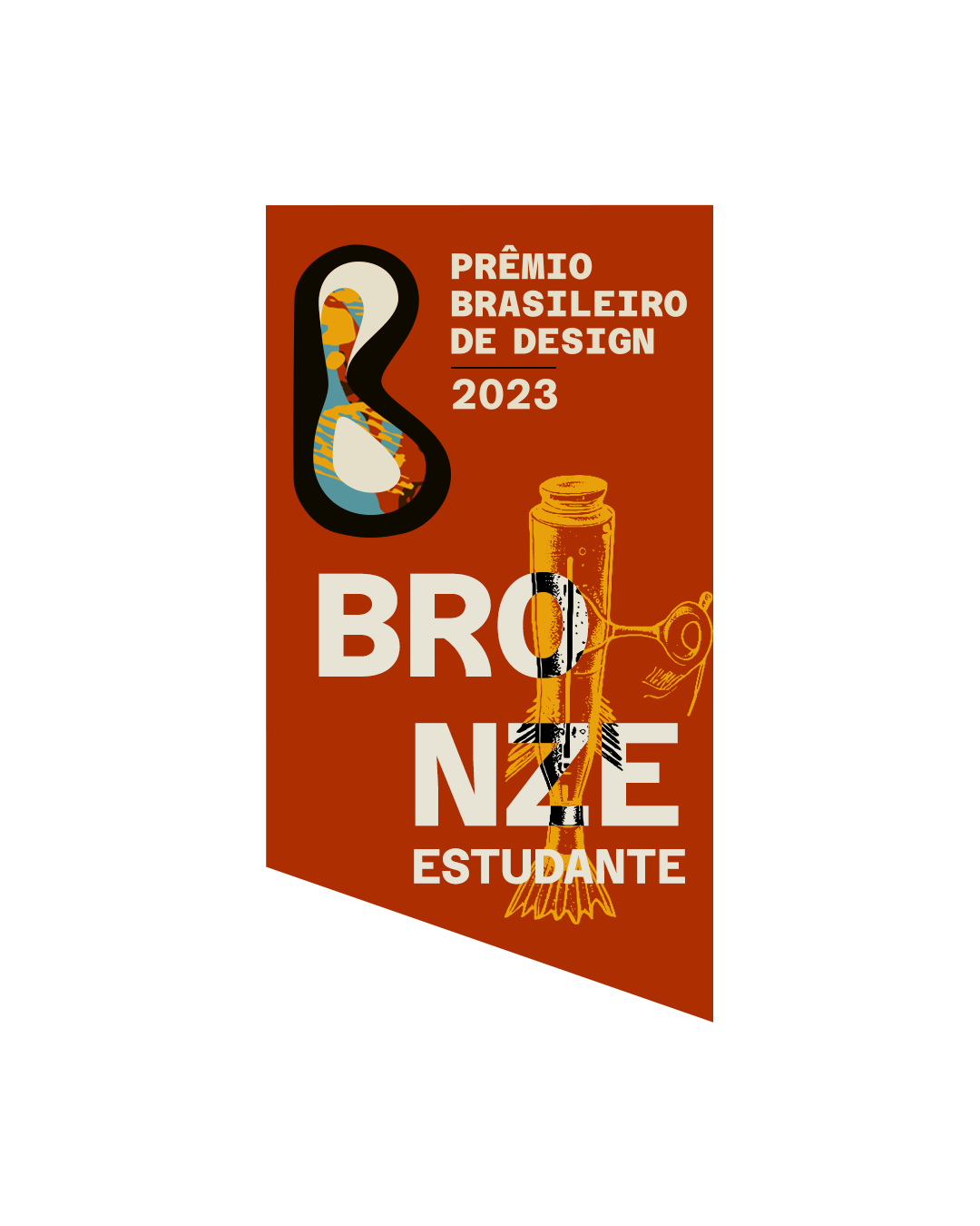
We chose a theme that focused on packaging design, emphasizing Brazilian characteristics and originality, with the goal of strengthening Brazilian history and culture. The project received the Brazilian Design Award 2023 in the Bronze category in the student modality.
Cachaça Pedra Branca
PACKAGING | ILLUSTRATION | INFOGRAPHICS


Pedra Branca cachaça has its headquarters and foundation in the city of Paraty, Rio de Janeiro. Its founder, civil engineer Lúcio Gama Freire, has a strong sustainable vision in its processes, promoting local commerce, and enhancing the tourist experience at the distillery, highlighting the quality of artisanal cachaça and the historical significance of the Paraty region. After an extensive research process, we traveled to the city to immerse ourselves further in the culture, the production of artisanal cachaça, and the history of the region.


The Pedra Branca logo was created to encompass the history of the city, the brand's context, and its products. Produced through linoleum engraving, it reflects the brand's essence through craftsmanship and its unique character. Additionally, for the main cachaça line, we defined four contextualizing themes that we deemed of great importance to the city of Paraty.

.jpg)
.jpg)
.jpg)
.jpg)
.jpg)
.jpg)
.jpg)
As a result, we created a complete product family for the brand. With five packaging designs for cachaça, three types of liqueurs, and a molasses packaging. We also produced variations of the label to be applied in the three possible formats: 700ml, 275ml, and 50ml.
The artisanal and sustainable character is also present in the substrate used for packaging, made from sugarcane fiber produced by Moinho Brasil. Its layout aims to highlight the illustrations and visual identity of the company, encouraging consumers to handle the bottle to read the legal and mandatory information that is horizontally placed.
.jpg)
.jpg)
The brand also extends to other applications, such as point-of-sale materials, cups, an Instagrammable panel, and even an infographic about the production process, detailing all stages and emphasizing the sustainability present in each one.

